
The GPX™ main window opens after you start and log in to GPX™. The window is your starting point for accessing all the functionality that is available in GPX™.
As shown in the previous figure, when the GPX™ main window first opens, specific Window components are dimmed. These components are enabled only after you create a new project or select an existing project. To facilitate the understanding of the information in this section, the figure below shows the GPX™ main window with all the components enabled.
GPX™ main window
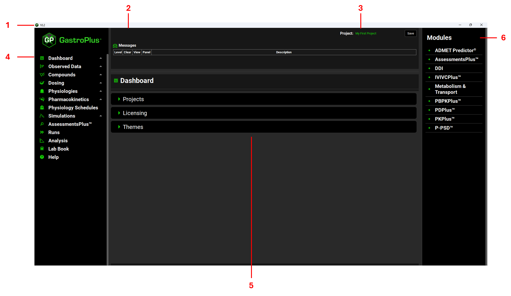
The GPX™ main window has the following components:
-
(1) Title bar
-
(2) Messages Center
-
(5) Workspace
-
(6) Modules
Title bar
The title bar of the GPX™ main window always displays the software icon and version number in the left corner. The title bar also displays the standard Windows icons for minimizing, maximizing, and closing the window in the right corner.
Messages Center
The Messages Center in GPX™, located at the top of the interface, provides the user with real-time guidance throughout their model building, as well as offering the ability to check for warnings in the setup of simulations.
There are various types of messages: Information, Warning, Caution, Critical and Error. All messages come with a description and a location in terms of the specific view and panel. The user is advised to read messages as soon as they appear, address the message as required, and then promptly clear the message from the Messages Center by clicking on Done.
Some examples of messages:
-
Information: When the liver blood flow is changed if the gastrointestinal physiology is changed from fasted to fed or vice versa in the Gastrointestinal panel.
-
Warning: To consider re-estimating the liver first pass extraction when the pharmacokinetic model is changed in the Simulations view.
-
Caution: When the paracellular permeability calculated in the Permeability sub-panel in the Simulations view gives a value higher than the total Peff.
-
Critical: If a physiology does not have a PEAR physiology created and PhysiologicallyBased is selected as the Pharmacokinetic Model in the Simulations view.
-
Error: In cases when there is an error in copying a project or creating a template.
Project field and Save button
The Project field displays the name of the GPX™ project that you are creating in GPX™ or that you have loaded into GPX™. Beside the Project Name field is the manual Save button.
Navigation pane and Views
In GPX™, a project is comprised of multiple components called assets. A view correlates to a specific GPX™ project asset and displays the inputs and actions that are relevant to the asset. The Navigation pane displays all the views in the general order (the workflow) that are required to create, run, and analyze a project in GPX™. To open a view in the GPX™ workspace, click the corresponding option in the Navigation pane.
GPX™ simulation workflow
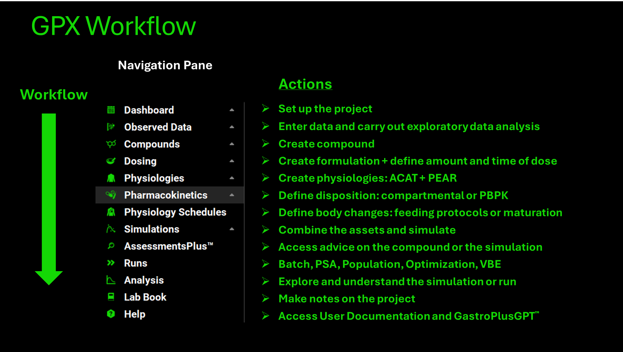
|
View |
Action |
|
Dashboard |
Create or load a GPX™ simulation project. |
|
Observed Data |
Enter data and carry out exploratory data analysis. |
|
Compounds |
Create compound and enter compound-specific data. |
|
Dosing |
Create formulation and define the amount and time of the dose. |
|
Physiologies |
Create species. |
|
Pharmacokinetics |
Define how the body handles the compound. |
|
Physiology Schedules |
Define how the physiology changes for the project, for example, switching between the fed state and the fasted state. |
|
Simulations |
Combine the assets, define the simulation settings, and then run a single simulation. |
|
AssessmentsPlus™ |
Access advice on the compound or the simulation |
|
Runs |
Batch simulations, Parameter Sensitivity Analysis (PSA) or Population Simulations. |
|
Analysis |
Explore and understand the simulations. |
|
Lab Book |
Record notes regarding the modeling process |
|
Help |
Access User Documentation and GastroPlusGPT™ |
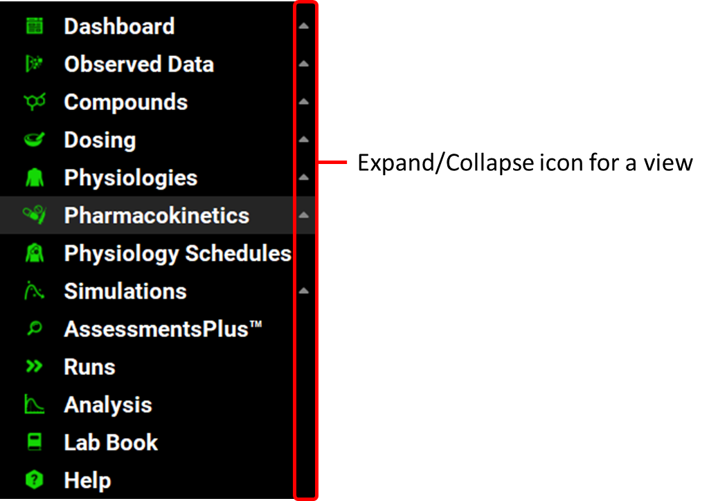
A view is comprised of one or more panels, and in some instances, one or more sub-panels as well. When the GPX™ main window first opens, the Expand/Collapse icon that is displayed to the right of each view option in the Navigation pane is pointing up, which indicates that the view is collapsed.
Navigation pane with View options
Workspace
The workspace refers to the area where you interact with the GPX™ user interface through panels, and sub-panels. See:
The topics in this section describe the physical layout and basic operation of panels and sub-panels. For detailed information about the inputs and other options that are displayed in all the panels and sub-panels for the GPX™ views.
Views and panes
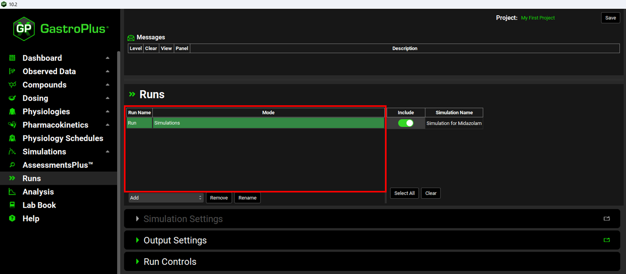
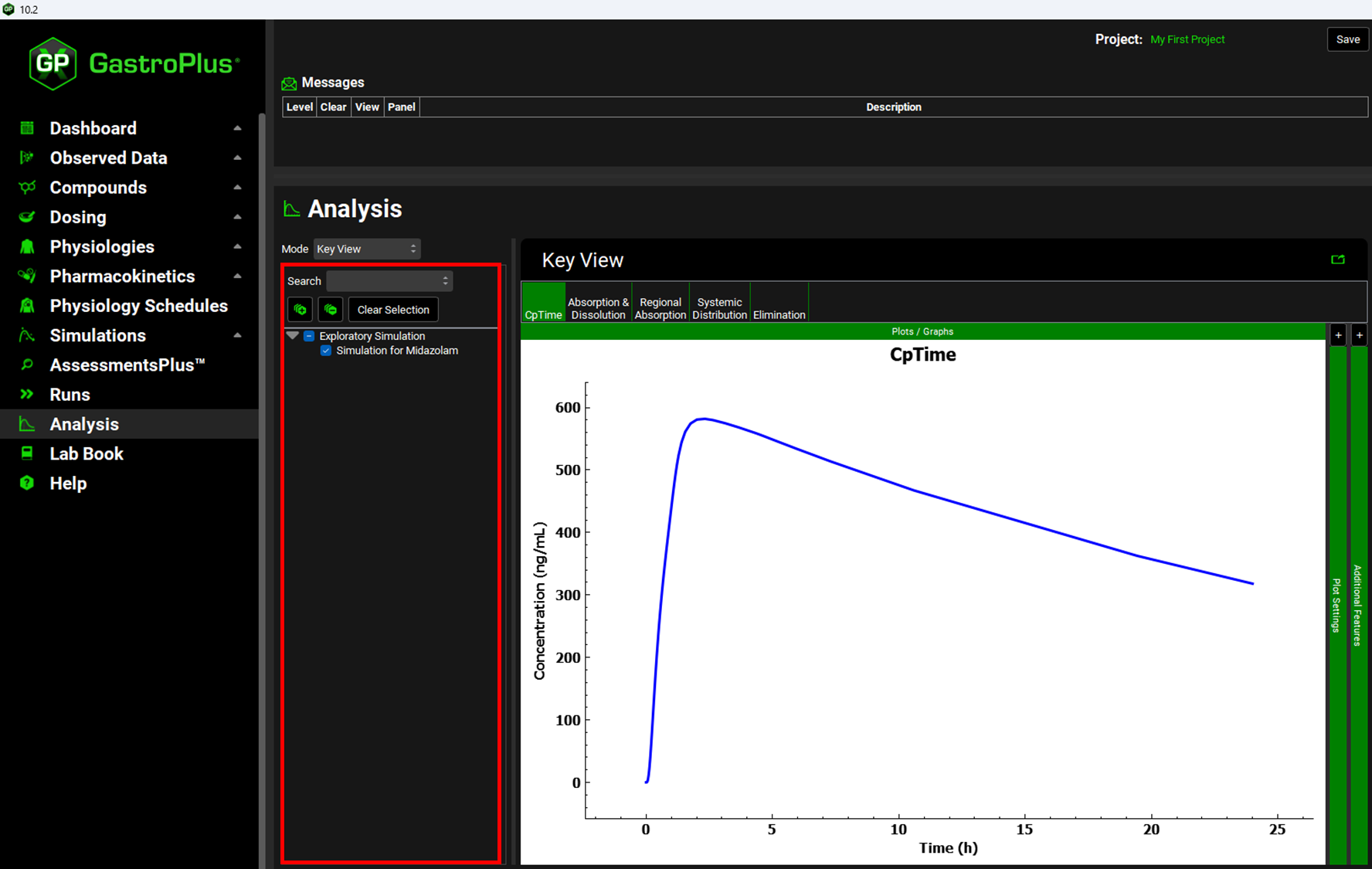
A pane is a fixed rectangular or square area within an open view that shows relevant inputs and options specific to that view. When a view contains both panes and panels, the panes appear at the top of the view, positioned above the list of panels. For instance, in the Runs view, a Run pane is displayed above the panels (such as Simulation Settings and Output Settings). If a view lacks panels, a pane can be placed anywhere within the view—whether at the top, left side, or elsewhere. For example, in the Analysis view, a Runs pane appears on the left side.
Example of a pane: the Run pane in the Runs view
Example of a pane: Run pane in the Analysis view
Views and panels
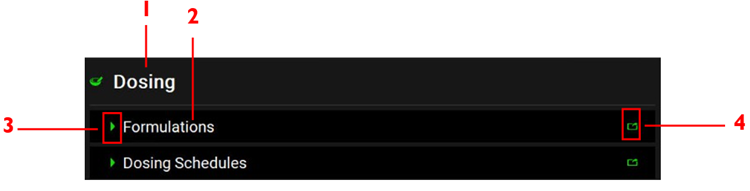
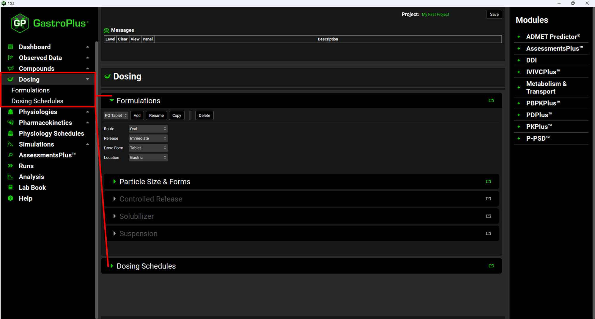
A panel is the top level in the hierarchy for a view. A panel displays inputs and options that are relevant for the specific view. Structurally, a panel is aligned one level in and directly under the (1) parent view and it has (2) a title bar, (3) an Expand/Collapse icon that is displayed to the left of the panel name, and (4) a Pop-out icon, which is the single icon that is displayed in the far right corner of the title bar for the panel.
Example of panel structure (Dosing view, Formulations panel)
You have two options for displaying and expanding (opening) all the panels for a view: a View option and a Panel option.
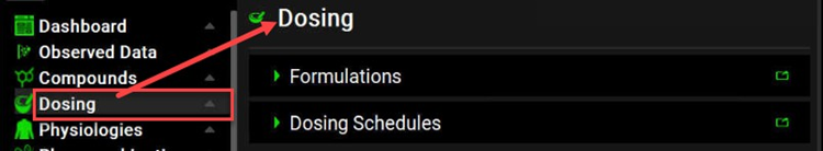
View option
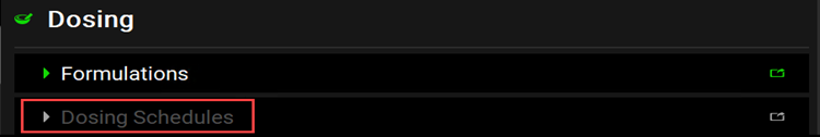
You can click the view option directly in the Navigation pane. When the view opens in the workspace, all the available panels for the view are displayed in a specific order and are collapsed (closed). If the information that you must specify in a panel is dependent on other information being entered in a preceding panel, then the title bar of the panel is dimmed. For example, when the Dosing view first opens, it consists of the collapsed Formulations panel, and the collapsed Dosing Schedules panel. Initially, “Dosing Schedules” is dimmed because you cannot specify a dosing schedule until you have added at least one formulation, for example, an oral tablet. After you add at least one formulation, then the Dosing Schedules panel becomes available.
Dosing view, collapsed Formulations panel and disabled Dosing Schedules panel
Dosing view with Formulations panel and Dosing Schedules panel enabled
-
To open a collapsed panel, you have two options. You can click the Expand/Collapse icon for the panel, or you can double-click anywhere in the title bar of the panel other than the Pop-out icon.
-
To close an expanded panel, you have two options. You can click the Expand/Collapse icon again, or you can double-click anywhere in the title bar of the panel other than the Pop-out icon.
If a view contains more than one collapsed panel, then you might have to scroll to see all the available panels. After you open a panel in the workspace, you might have to scroll to see the entire panel. For more information about scrolling the workspace display, see Working with panels and sub panels.
Panel option
You can click the Expand/Collapse icon for the view to expand the view options and display all the available panels for the view in the Navigation pane. You can then double-click a panel option to open and display the panel in the workspace. For example, if you expand the Dosing view, then two panel options are displayed: Formulations and Dosing. To open and display the Formulations panel in the workspace, double-click Formulations in the Navigation pane.
Expanded View option with panels in Navigation pane
-
To close an expanded panel, you have two options. You can click the Expand/Collapse icon for the panel, or you can double-click anywhere in the title bar of the panel other than the Pop-out icon.
-
To open a collapsed panel, you have two options. You can click the Expand/Collapse icon again, or you can double-click anywhere in the title bar of the panel other than the Pop-out icon.
If you open more than one panel in the workspace, you might have to scroll to view an entire panel. For more information about scrolling the workspace display, including regional scrolling, see Working with panels and sub panels.

Regardless of the option that you use to open a panel, the panel remains open for the duration of your GPX™ session. It is recommended to manually close an opened panel once you have finished working with it during a GPX™ session. If you close a GPX™ session before you close any opened panels, then when you start GPX™ again, all panels for all views are again closed.
Panels and sub-panels
A sub-panel is the second level in the hierarchy for a view. A sub-panel displays additional inputs and options for the view. Structurally, a sub-panel is aligned in one level in and is located either directly beneath its (1) parent panel or on the right side of its parent panel and it has (2) a title bar, (3) an Expand/Collapse icon that is displayed to the left of the sub-panel name, and sometimes (4) a Pop-out icon, which is the single icon that is displayed in the far right corner of the title bar for the sub-panel.
Example of sub-panel structure (Biorelevant sub-panel for Solubility panel)
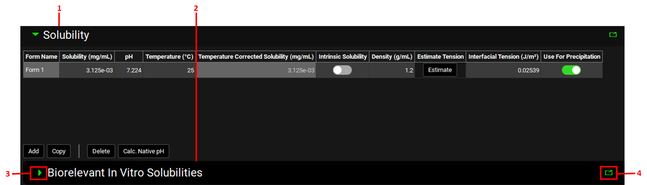
If one or more sub-panels are present for a panel, then when the panel is first opened, all the available sub-panels for the panel are displayed in a specific order and are collapsed (closed). For example, as shown in the figure above, in the Compounds view, if you open the Solubility panel, then a Biorelevant In Vitro Solubilities sub-panel is displayed.
As with panels, you have multiple options for opening and closing a sub-panel.
-
To open a collapsed sub-panel, you have two options. You can click the Expand/Collapse icon for the sub-panel, or you can double-click anywhere in the title bar of the sub-panel other than the Pop-out icon.
-
To close an expanded sub-panel, you have two options. You can click the Expand/ Collapse icon again, or you can double-click anywhere in the title bar of the sub-panel other than the Pop-out icon.
If a view contains more than one collapsed sub-panel, then you might have to scroll to see all the available sub-panels. After you open a sub-panel in the workspace, you might have to scroll to see the entire sub-panel. For more information about scrolling the workspace display, including regional scrolling, see Working with panels and sub panels.
Regardless of the option that you use to open a sub-panel, the sub-panel remains open for the duration of your GPX™ session. It is recommended to manually close an opened panel once you have finished working with it during a GPX™ session. If you close a GPX™ session before you close any opened sub-panels, then when you start GPX™ again, all sub-panels for all views are again closed.
Working with panels and sub-panels
Options are available for editing values in a field on a panel or sub-panel and for optimizing the workspace display: vertical scrolling and popping out. See:
Data field value
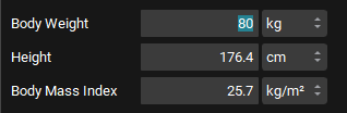
If a data field on a panel or sub-panel contains a value that you can edit, then you have three options for selecting the value for editing. You can:
-
Click once in the field, and then drag your cursor over the entire value to select it.
-
Double click in the field to select the entire value in a single step.
-
Click once in the field, and then use the Windows [CTRL] + [A] keyboard shortcut to automatically select the entire value in a single step.
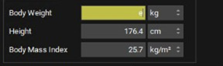
After you select the value, you can then manually edit the value. If you edit the value incorrectly (for example, you enter a special character in a numeric only field), or leave the field blank, then the field is automatically highlighted in yellow to indicate that the current value is not a valid value. After you enter a valid value in the field, the yellow highlighting is removed from the field.
Field selected for editing example (Body Weight)

Field with invalid value entered
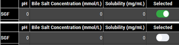
Toggle
Some of the options for a panel or a sub-panel might be presented as a toggle, which is an option that you can turn on or off by clicking it. In GPX™, when an option that is a toggle is turned on, the toggle is green. To turn off the option, click it. The toggle turns gray.
Toggle examples
Vertical scrolling
Vertical scrolling in GPX™ is region-dependent, which means that you can scroll the entire view, or you can scroll just a specific panel or sub-panel for a view.
-
To scroll the entire view, which includes all panels and sub-panels, you can click and drag the scroll bar (thin, vertical, gray line) that is displayed at the far-right side of the view, or you can click in any blank space in an open panel, and then use the scroll wheel on your mouse.
-
To scroll only the sub-panels for a panel, click anywhere in an open sub-panel, and then use the scroll wheel on your mouse.
Pop-out function
A popped-out panel or sub-panel is a panel or sub-panel that is visible on your desktop screen, but it is not confined to specific location in the workspace. Instead, you can independently change its size and/or location.
To pop-out a panel or sub-panel, click its Pop-out icon ( 
-
To move the popped-out panel or sub-panel, click and hold your mouse pointer in its title bar, and then drag the panel or sub-panel to its new location.
-
To re-size the popped-out panel or sub-panel, use standard Windows commands.
-
To return the popped-out panel or sub-panel to its default location in the workspace, click the Close (x) icon in its title bar. When the popped-out panel or sub-panel is returned to its default location in the workspace, it remains open.
Example of a popped-out panel
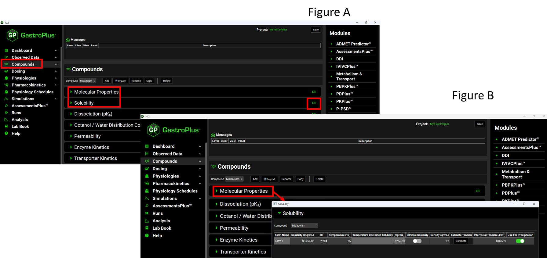
As shown in Figure A, the default layout of the workspace, Solubility is a panel that is displayed beneath the Molecular Properties panel; however, in Figure B, the panel has been popped-out and is independent of the panels in the workspace.
Panel/sub-panel Search feature
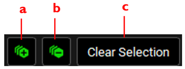
A Search feature is available for many of the panels and sub-panels in GPX™ as well as for some panes in the Analysis view. You use this feature to search a hierarchy tree for pane-specific, panel-specific, or sub-panel specific information such as simulations, plot options, plot variables, or project parameters. The Search feature is always displayed above a list that you can search, and it has the structure shown in the figure below.
Search feature
|
Option |
Description |
|
(a) Expand icon |
Expands all the entries the hierarchy tree. |
|
(b) Collapse icon |
Collapses all the entries in the hierarchy tree. |
|
(c) Clear Selection |
Clears any selected entries or simulations. |
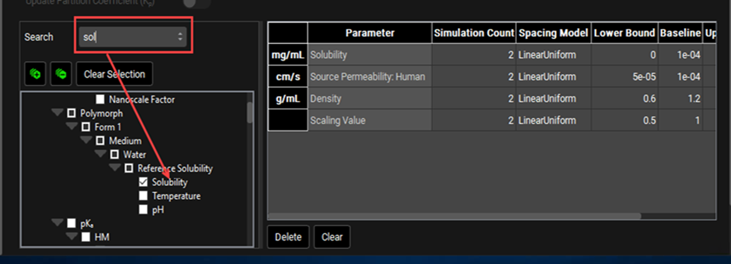
For example, a hierarchy tree of available simulation parameters is displayed in the Simulation Parameters list in the Simulation Settings panel for the Runs view. Instead of manually expanding the hierarchy of this parameter list to search for a specific simulation parameter, you can use the Search feature. For example, to search for the Solubility parameter, you have two options. You could:
-
Expand the following options: Compound > Compound Name > Polymorph > Form 1 > Medium > Water > Reference Solubility, and then select Solubility.
-
Enter the search string sol in the Search field.
Example of a panel Search feature
The Search feature has the following caveats:
-
The search is limited to the exact order of the characters in the string, but the string is not case-sensitive, and it can appear anywhere in the search results.
-
After you enter a search string, press [Enter] to carry out the search. Only those results (plot options, plot variables, or simulation parameters) that match the search string are displayed. For example, if you entered the search string sol in the Search field in the Simulation Parameters list, and then pressed [Enter], the list hierarchy is expanded to show those simulation parameters that match the search string, such as Solubilization Ratio, Reference Solubility, Solubility, and Solubility Factor.
-
You can select the search results that are relevant to your project and work with the selected results as appropriate. For example, if your search of simulation parameters returned results such as Solubilization Ratio, Reference Solubility, Solubility, and Solubility Factor, you could select Solubility and then edit its default value.
-
If the search term that you select has sub-level entries, then all the sub-level entries are automatically selected. You can manually select and clear list entries.
-
To clear a search and reset a list to its default hierarchy (for example if no terms are returned and the list is empty), clear the Search field, and then press [Enter].
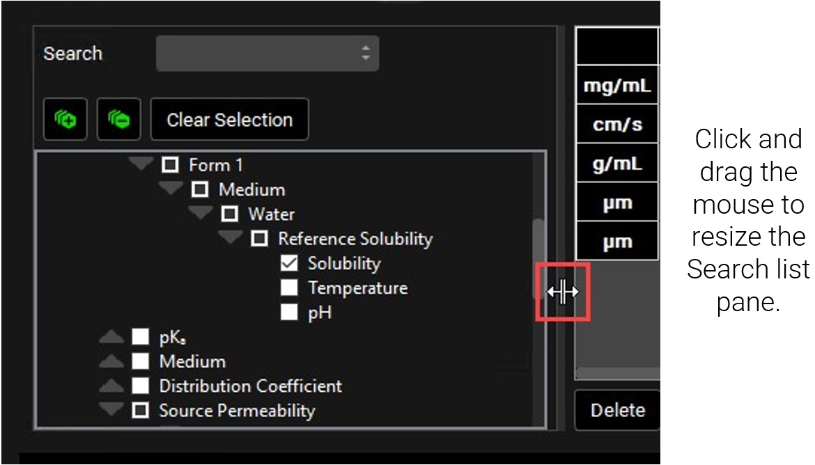
If the entries in a hierarchy tree that you are searching are obscured/collapsed to the point that you are unable to read an entry in full, then you can use the standard Windows technique of resizing the pane to view the complete entry. See image below: Resizing a Search list pane.
Resizing a Search list pane
Modules
An optional module is a module that is not part of the base GastroPlus® license. Instead, your organization must purchase the module separately. An optional module extends the capabilities of GastroPlus®. For example, the Metabolism and Transporter Module is an optional module that extends the capabilities of GastroPlus® to include non-linear pharmacokinetics into any compartment (gut, liver, and/or any PBPK tissue), along with metabolite tracking. The Modules pane lists all of the optional modules that your organization has purchased and implemented for your GPX™ installation.