
To view the results of a simulation or run, six options are available in the Analysis view for visualizing and investigating the results: Key View, Deep View, Summary View, Sensitivity View, Population View, and Optimization View. Key View, Deep View, and Summary View are available for all types of simulations and run modes; Sensitivity View, Population View, and Optimization View are available only for their respective run modes (parameter sensitivity analysis, population simulation/virtual bioequivalence, and optimization).
While each view provides unique options and different insight into the results of the simulations, they build upon each other to provide a full picture for interpreting the data and identifying the keys areas of the simulation that worked well and also the areas that need attention or improvement.
The first section, Common Features of the Analysis Views, details the features that are common to all six Analysis views. The second section, Analysis View Options, details each of the six different Analysis Views on an individual basis, including the options and information that are unique to each.
This section covers the following topics:
Common Features of the Analysis Views
To view the results of the simulation or run, six Analysis views are available for visualizing and investigating the results: Key View, Deep View, Summary View, Sensitivity View, Population View, and Optimization View. While each View provides unique options and different insight into the results of the simulations, they also have the following features in common:
-
Basic layout, including a View drop-down list, a Run pane, a Plot pane, and a Run pane toolbar. See Plot layout.
-
Search feature. See Panel/sub-panel Search feature.
-
Plot options. See Plot Settings and Plot Options.
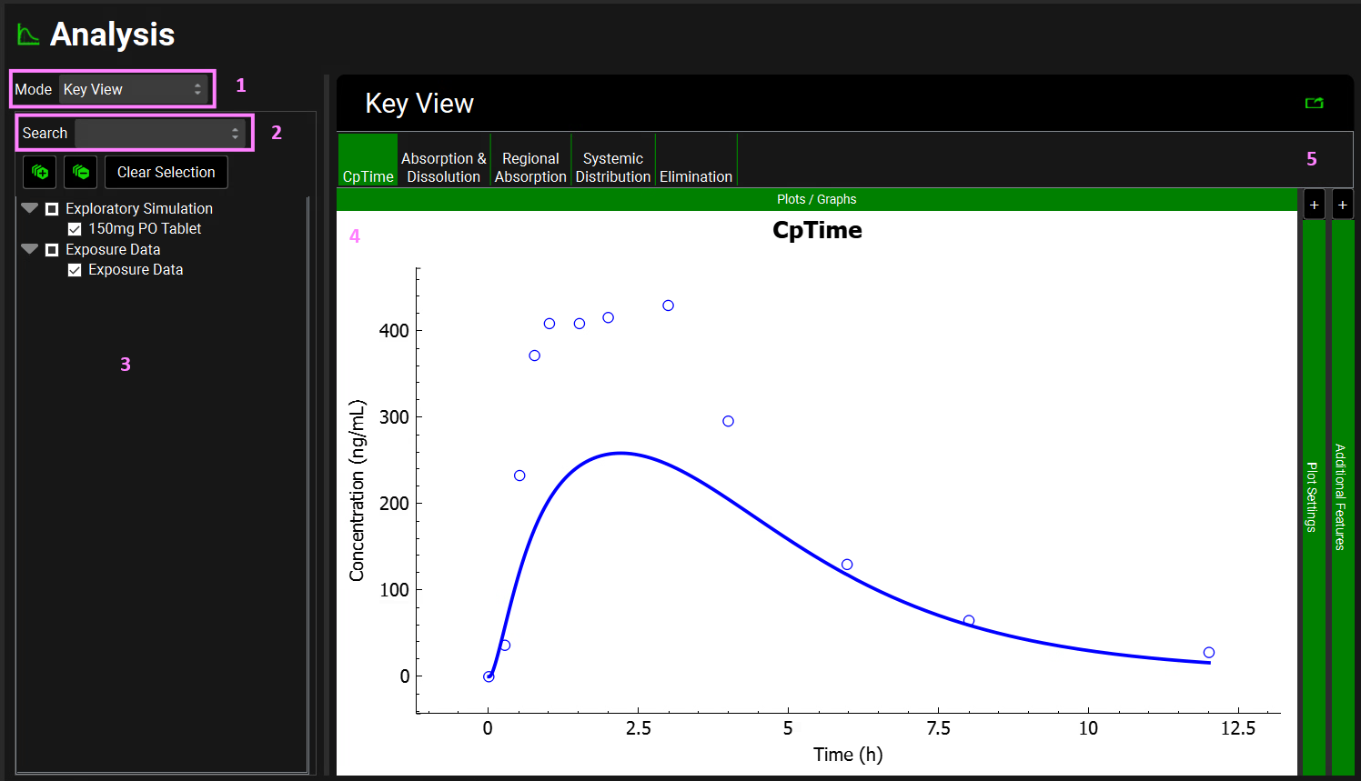
Plot layout
All six Views in the Analysis view have the same basic layout.
Analysis view, basic layout
|
Option |
Description |
|
1 Mode |
A drop-down. Selects the option for the Analysis view. Available options are Key View, Deep View, Summary View, Sensitivity View, Population View, and Optimization View. |
|
2 Search |
Provides a means of searching the Simulation names. See Panel/sub-panel Search feature. Note: To return to the full list of simulations, clear the Search box and press return. |
|
3 Run Pane |
Displays all the simulations that were run for the project in the current session.
Previously completed simulations or runs will be available within the same GPX™ session. Re-running a simulation or run will, however, overwrite the existing results. |
|

|
A button. Expands all levels in the hierarchy tree. |
|

|
A button. Collapses all levels in the hierarchy tree. |
|
Clear Selection |
A button. Clears all the selected simulations from the plot. |
|
4 Plot Pane |
The relevant plot for the selected mode is displayed in the Plot pane. For example, for Key View, the Cp-Time profiles for the selected simulations/ runs are displayed. |
|
5 Plot Settings and Additional Features |
Options for changing the display of the plot in the Plot pane, including the plot legend, the plot title, and so on. See Plot Settings and Plot Options. Click the “+” to expand the panel. The symbol will change to a “-“ which can then be clicked to collapse the panel. |
Plot Settings and Plot Options
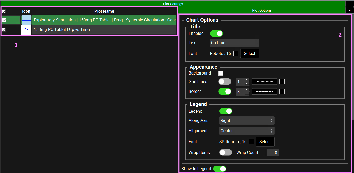
When a simulation plot is first generated for any View in the Analysis view, the plot is generated using the defaults for its various options, such as plot title, plot line width, color, and style, and so on. The Plot Settings pane displays the series names (Plot Name), the Plot Options pane displays and organizes all the options that can be edited for a plot. Other than for Summary View, the Plot mode determines the plot options that are displayed in the Plot Settings and Additional Features pane.
Plots generated elsewhere in GPX™, for example, the Dissociation (pKa) panel and the optional PKPlus™ and PDPlus™ Modules, also use the same layout and functionality that is described below.

Summary View is an onscreen report that summarizes the key details about a simulation such as the Cmax and AUC∞ for the compound. Plot Settings, therefore, are not applicable for the Summary View.
See:
General plot options
General plot options include options such as the plot title, the color of the plot title, and the color and style for plot gridlines. General plot options are available for all views other than Summary View and for all five plot types in the Key View.
Analysis view, Plot Settings and Plot Options: Chart Options
|
Option |
Description |
|
Plot Settings |
This section, comprised of the checkbox, icon, and name for each curve, gives an overview of the series displayed (based on the runs/simulations/series selected on the left-hand side of Analysis View or on the Key View ribbon). |
|
Checkbox |
Controls whether the indicated series will be displayed on the plot. The top checkbox can be used to check/uncheck all series. |
|
Icon |
The icon previews how the series, as a line and/or points, will be displayed on the plot. |
|
Plot Name |
The name of the series. The initial name is based on the run name, simulation name, and specific simulation output. These can be renamed by double clicking in the cell. Series (also called curves) can be selected here in order to use the series-specific formatting and display options described in Plot Options below. A single series can be selected by clicking on the name. Multiple series can be selected by ctrl-clicking, shift-clicking, or by clicking-and-dragging. |
|
Plot Options |
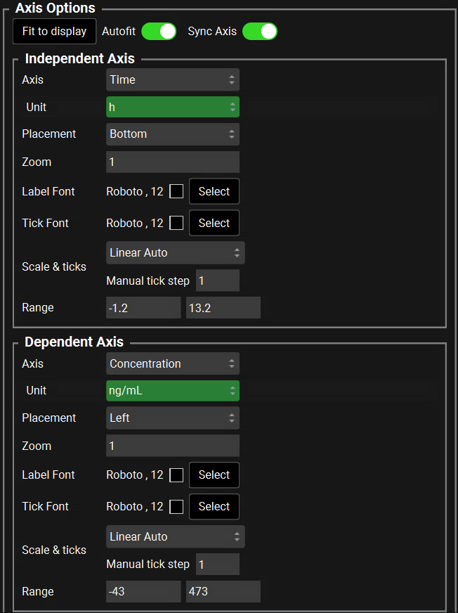
This section contains options regarding the display of plot features and series. It is divided into three sections: Chart Options, Axis Options, and Plot Options. Chart Options covers plot-wide settings, such as the title, legend, and gridlines. Axis Options covers the style and range of the independent and dependent axes. Plot Options provides control over the line and point display style. |
|
Chart Options: Title |
The plot title. In Key View, a plot title is displayed at the top of every simulation plot in a default color. The following properties for a plot title can be edited:
|
|
Chart Options: Appearance |
The appearance of the overall plot.
|
|
Chart Options: Legend |
By default, a Legend is not shown on a plot. To display the legend, the legend must first be toggled On, and specific curves must then be added to the legend. Once the legend is displayed, the placement and style can be adjusted. The legend is enabled using the Legend toggle. To add specific curves to the legend, select all curves to be displayed in the legend on the graph in the Plot Name section using the mouse (click to select a single curve, ctrl-click, shift-click, or by click-and-drag to select multiple curves), and activate them using the Show in Legend toggle (see below).
|
|
Show in Legend |
A toggle. Controls whether the currently selected series (under Plot Name, see above) will be displayed in the legend. When toggling on or off, the setting will be applied to all currently selected series. The text “Show in Legend” will be red if the current setting does not match the setting for all currently selected series. |
Axis plot options
Identical options are available for both the independent plot axis and the dependent plot axis. Axis plot options are available for all views other than Summary View and for all five plot types for Key View.
|
Option |
Description |
|
Fit to Display |
A button. Used to apply the changes made to the degree of zoom or rescales the plot to ensure the axis captures all of the series selected (even if they aren’t currently displayed) when Autofit is turned off. |
|
Autofit |
A toggle. Controls whether the axis limits will automatically update when curve selection is changed on the Simulations List. On by default. |
|
Sync Axis |
A toggle. When two or more dependent axes are present, controls whether they will be zoomed together. Applies to zooming on the plot by mouse scrolling, not manual changes to the axis range under Axis Options. On by default. |
|
Axis |
A drop-down. Selects the current independent or dependent axis, to which the below settings will be applied. Time is typically the only option for the independent axis. Typical options for the dependent axis include concentration, mass, length, frequency, and fraction, depending on which series are selected for the plot. |
|
Unit |
A drop-down. Selects the unit for the currently selected axis. Available units depend on the axis selected. For example, Time will have units of h, min, and s, while Mass will have units of kg, g, mg, µg. |
|
Placement |
A drop-down. Selects the placement of the axis relative to the plot (Top or Bottom for the independent axes, Left or Right for the dependent axes). The default value is Bottom for the Independent axis and Left for the Dependent axis. If there are multiple Independent or Dependent axes, different axes may be displayed on the different sides of the plot. |
|
Zoom |
The zoom level for a plot. Default value is 1. The default can be used or the value can be edited. Takes effect when Autofit is selected or when Fit to Display is clicked (see above). |
|
Label Font |
The font characteristics (style, size, and color) for the axis label. The defaults are Roboto, 12, and black, respectively.
|
|
Tick Font |
The font characteristics (family, size, and color) for the axis tick marks. The default values are Roboto, 12, and black, respectively.
|
|
Scale & ticks |
Controls the scale (linear vs logarithmic) and tick spacing for the axis.
The tick spacing for Linear Auto is automatically calculated based on the axis range. For logarithmic scales, tick marks are always spaced in base 10. |
|
Range |
The minimum and maximum values for the axis range. The selected scale (linear or logarithmic) determines the default values. The default values can be used or one or both values can be edited. |
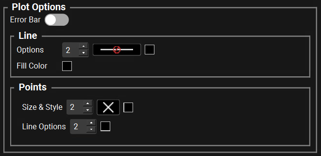
Line and Points options
Line and Points options are available for all plots in GPX™. By default, observed data is displayed as Points and predictions or fitted series are displayed as Lines. To change the value for a Line or Point option one or more series must be selected (they will be highlighted in green).
The checkbox next to the curve name simply indicates that the series will be displayed on the plot. To edit the line or points the series must be highlighted.
|
Option |
Description |
|
Error Bar |
A toggle. Controls whether error bars will be displayed on the plot. This applies only to observed data series with CV values; it will have no impact on simulation results on series without an associated CV. On by default for series with an associated CV, Off by default for all other series. |
|
Line - Default values are supplied for all line properties, but these values can be edited. |
|
|
Options |
|
|
Fill Color |
This option allows the area under the simulated line to be colored to zero. By default, an empty square (black) is displayed. To change the color of the plot fill, select the desired series, click the Plot Fill (solidly filled square) icon to open the Select a color dialog box, and then select a basic color, Pick a Screen Color, or create a custom color for the line. The Plot Fill icon displays the color specified. To remove a Plot Fill, select the series, click the Plot Fill icon to open the Select a color dialog box. Select white, set the Alpha channel to 0 and then click OK. |
|
Points - Default values are supplied for all point properties, but these values can be edited. |
|
|
Size & Style |
|
|
Line Options |
|
|
Bar plots - Applicable for the Key View plot of Regional Absorption |
|
|
Color |
The default color is blue. To change the color of the bars, click the Color (solidly filled square) icon to open the Select a color dialog box, and then select a basic color, Pick a Screen Color, or create a custom color for the point. The Color icon displays the color specified. |
|
Transparency |
The maximum allowed value is 100. |
Additional Features
Several additional options are available for use with the plots.

|
Option |
Description |
|
Show simulation results for: |
Checking the box next to a simulation name puts the simulation results onto the plot. To move the box containing the simulation results to a different position click and hold the cursor anywhere on the box and move the cursor to the desired position. |
|
To use the following options, the simulation name must be clicked to highlight it in green in the Show simulation results for box. |
|
|
Font |
The font characteristics (style, size, and color) for the simulation results.
|
|
Border Style |
Displays the current color, style and width of the border.
Note: To hide the border from a selected simulation results from the Plot display, select the default style that is marked with the international Do Not Allow/ Prohibited symbol.
|
|
Fill Color |
To change the fill color of the Simulation results, click the Fill color (solidly filled square) icon to open the Select a color dialog box, and then select a basic color, Pick a Screen Color, or create a custom color for the point. The Fill color icon displays the specified color. |
|
Color by options allow the default color to be altered for all series on a plot. |
|
|
Color by: |
A button. Used to apply the changes made to the selector described below. |
|
Color by selector |
Default option is tissue. Click the currently displayed selection to open a drop-down list and select another option.
|
|
Show mass as percent of dose changes all series displayed as a mass to a percent of the dose |
|
|
Show mass as percent of dose |
A toggle. Controls whether all mass series displayed on the plot will be shown as mass (toggled off, default), or as a percent of the total administered dose (toggled on). Note: the selected setting will persist for the current GPX™ session. |
Plot navigation options
Several options are available for adjusting the plot display to better suit individual working requirements. Namely:
-
Pan the plot display. To pan the plot display, click and hold the cursor anywhere on the plot, and then drag the display to the right, left, up, and/or down.
-
Zoom the plot display. To zoom the plot display, place the cursor on the plot, and then use the scroll wheel on the mouse to zoom the display in and/or out.
Plot context menu
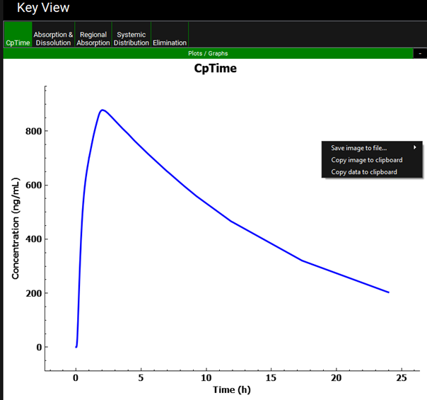
Right-click any plot that is displayed in the Plot pane to open a Plot context menu with the following options:
|
Option |
Description |
|
Save image to file |
Opens a second menu with options for saving the currently displayed plot to an image file: a *.png, *.jpg, *.bmp, *.pdf, or *.svg. Additional custom image size options are also available to manually set the height, width, and scale factor. When the plot is saved as an image file, both the file name, and the location in which to save the file must be specified. |
|
Copy image to clipboard |
Opens an additional context menu providing options to copy the plot to the clipboard. Once copied, the standard Windows commands can then be used to paste the copied image into a third-party application such as PowerPoint.
|
|
Copy data to clipboard |
Copies the data for the series currently displayed on the plot to the clipboard. The standard Windows commands can then be used to paste the copied data into a third-party application such as Microsoft Excel. |
Analysis View Options
Key View
The key information that should be routinely explored for any simulation has been organized in the form of five plots that are available in Analysis view, on the Key View ribbon. See:
The options for all five plots are displayed as a series of buttons in the Key View ribbon at the top of the Plot pane.
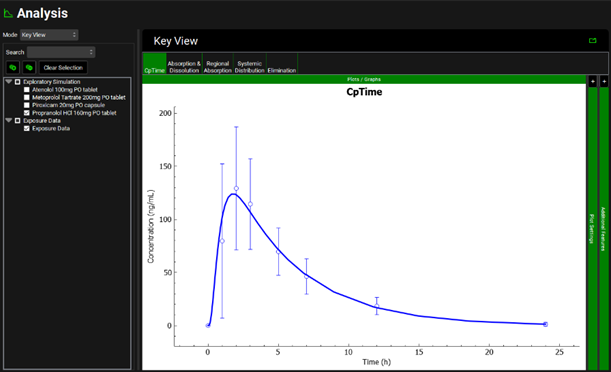
When a Simulation or Run completes, the Analysis View is opened and a Key View plot is displayed, either Cp-Time or the last plot that was viewed in Key View in the GPX™ session.
-
If one or more simulations have been run individually directly from the Simulations view, then an entry for each simulation is displayed under the default name of Exploratory Simulation in the Simulations list.
o To display the profiles for all the individual simulations in a single step, click on the check box next to Exploratory Simulation.
o To clear all the profiles for all the simulations in a single step, click on the filled check box next to Exploratory Simulations. One or more individual simulations can then be selected manually to display their corresponding profiles.
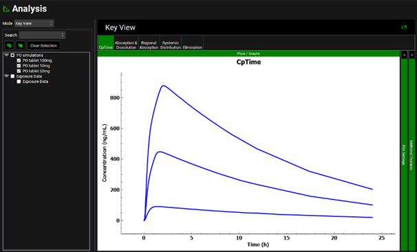
-
If a Run has been used (multiple simulations in a single run), then an entry for each individual simulation is displayed under the name of the Run in the Simulations list. By default, both the name of the Run and all the Simulations that were included in the Run are selected and the profiles for all the Simulations in the Run are displayed in the Plot pane.
o To clear all the simulations in a single step, click on the filled check box next to the name of the Run. Individual simulations can then be selected manually to display their corresponding profiles.
o To display the profiles for all the simulations in a single step, click the check box next to the name of the Run.
-
Observed data that has been linked to a series displayed on a Key View plot will automatically be displayed along with the simulated curve.
The above functionality is the same regardless of the Analysis Mode selected.
Cp-Time plot
The Cp-Time Key View plot displays the plasma concentration versus time curve plus any observed plasma concentration data that has been linked to the Simulation for the last Simulation run. Multiple results can be displayed from previous runs or simulations by following the instructions above.
Analysis view, Key view, Example of a single simulation with observed data selected for display
Analysis view, Key View, Example of a batch run with all simulations selected
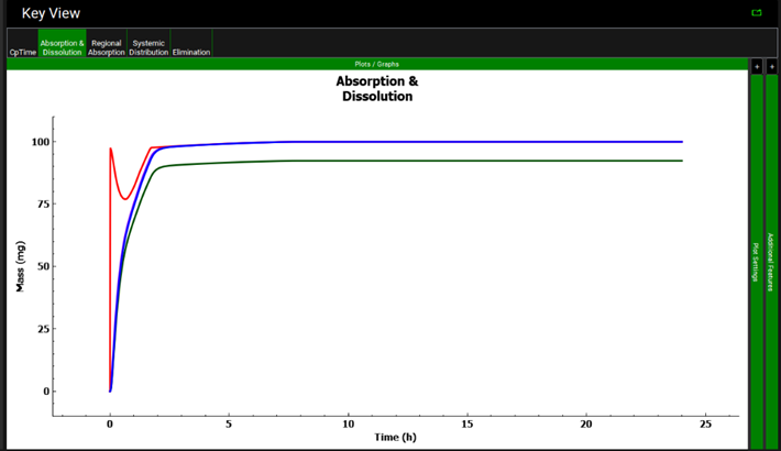
Absorption & Dissolution plot
The Absorption & Dissolution plot displays the time profile curves pertaining to the absorption and dissolution for a selected simulation, where the indicated colors are the default colors for the curves. By default, all the curves for the plot are displayed for the initial plot view. Multiple results can be displayed from previous runs or simulations by following the instructions above.
-
Red: The total mass of compound that was dissolved in the GI tract.
-
Purple: The total mass of compound that was absorbed in the GI tract.
-
Blue: The total mass of compound that entered the portal vein.
-
Dark Green: The total mass of compound that entered systemic circulation.
Depending on the input parameters for the simulation, some of the curves in the Absorption & Distribution plot might overlap other curves in the plot. To view a specific curve, open the Plot legend, and then clear default selections until the appropriate curve becomes visible.
Analysis view, Key View, Example of an Absorption & Distribution plot
Regional Absorption plot
The Regional Absorption plot is a bar graph that represents the total mass, by percentage, of the regional absorption of the compound in the ACAT model. Multiple results can be displayed from previous runs or simulations by following the instructions above. However, the percent absorbed values are not displayed if multiple simulations are selected. The values can be viewed by hovering over each individual bar.
Analysis view, Key View, Example of a Regional Absorption plot
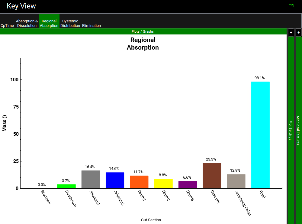
Because of the rounding of values that was implemented for display purposes, the sum of the individual values might not equal the Total value in the Regional Absorption plot.
Systemic Distribution plot
The Systemic Distribution plot shows the mass of the compound that is present in each compartment or tissue over the course of the simulation. The colors of the curves are consistent between different simulations of the same type and between different sessions of GPX™. The number of series that are displayed for the plot is dependent on the model that was used for the simulation and the number of compartments or tissues. For example, for a one-compartment PK model, the Systemic Distribution plot displays two mass curves: one for systemic circulation (blue) and one for liver (red) and an example is shown in the figure below. For a PBPK model, all the tissues in the model are displayed as mass curves on the plot and an example is shown in the figure below.
Due to the number of curves for a PBPK model, it is recommended to only view one simulation at a time for this Key View plot.
Analysis view, Key View, Example of a Systemic Distribution plot for a Compartmental model
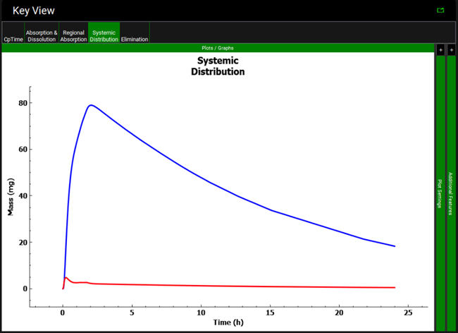
-
Blue: The total mass of compound in the systemic circulation.
-
Red: The total mass of compound in the liver.
-
Bright Green: The total mass of compound in compartment 2.
-
Pink: The total mass of compound in compartment 3.
-
Magenta: the total mass of compound in the gall bladder.
Analysis view, Key View, Example of a Systemic Distribution plot for a PBPK model
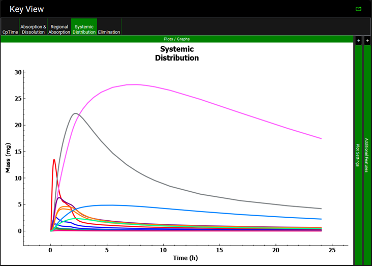
-
Blue: The total mass of compound in the arterial supply.
-
Blue: The total mass of compound in the venous return.
-
Cyan: The total mass of compound in the lung.
-
Purple: The total mass of compound in the spleen.
-
Red: The total mass of compound in the liver.
-
Pink: The total mass of compound in the adipose.
-
Grey: The total mass of compound in the muscle.
-
Olive: The total mass of compound in the heart.
-
Dark Purple: The total mass of compound in the brain.
-
Teal: The total mass of compound in the kidney.
-
Light Orange: The total mass of compound in the skin.
-
Magenta: The total mass of compound in the reproductive organ.
-
Dark Orange: The total mass of compound in the red marrow.
-
Light Blue: The total mass of compound in the yellow marrow.
-
Bright Green: The total mass of compound in the other tissues.
Elimination plot
The Elimination plot displays the tissue-specific curves for the elimination of the compound as well as the curves for the mass general clearance of the compound for a selected simulation. The colors of the curves are consistent between different simulations of the same type and between different sessions of GPX™. The color of the tissue-specific curves is consistent between the Elimination and Systemic Distribution Key View plots. The number of series that are displayed for the plot is dependent on the model that was used for the simulation and the number of compartments or tissues. By default, all the curves for the plot are displayed for the initial plot view.
Analysis view, Key View, Example of an Elimination plot
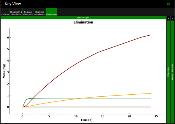
Due to the number of curves for a PBPK model, it is recommended to only view one simulation at a time for this Key View plot. A selection of the main curves is listed below.
Curves for the mass metabolized by each enzyme specified in each location indicated in the model are also included on this plot together with a total mass metabolized curve for each location.
-
*Dark Green: The total mass of compound that was eliminated via gut metabolism.
-
*Dashed Red: The total amount of undissolved compound that was excreted from the GI tract.
-
*Red: The total amount of dissolved compound that was excreted from the GI tract.
-
**Gold: The total mass of compound that was eliminated through renal clearance.
-
Gold: The total mass of compound present in the urine.
-
Cyan: The total mass of compound that was cleared by the lung.
-
Purple: The total mass of compound that was cleared by the spleen.
-
*Light Olive: The total mass of compound that was eliminated through biliary clearance.
-
*Green: The total mass of compound that was cleared by the liver.
-
Pink: The total mass of compound that was cleared by the adipose.
-
Grey: The total mass of compound that was cleared by the muscle.
-
Olive: The total mass of compound that was cleared by the heart.
-
Dark Purple: The total mass of compound that was cleared by the brain.
-
Teal: The total mass of compound that was cleared by the kidney.
-
Light Orange: The total mass of compound that was cleared by the skin.
-
Magenta: The total mass of compound that was cleared by the reproductive organ.
-
Dark Orange: The total mass of compound that was cleared by the red marrow.
-
Light Blue: The total mass of compound that was cleared by the yellow marrow.
-
Bright Green: The total mass of compound that was cleared by other tissues.
-
**Brown: The total mass of compound that was eliminated through general clearance.
-
*** Mustard: The total mass of compound eliminated by fixed first pass extraction from the simplified dosing compartment.
* - curve may be visible for compartmental and PBPK simulations
** - curve may be visible for compartmental simulations only
*** - curve may be visible for simplified simulations only
All other curves may be visible for PBPK simulations only.
Depending on the input parameters for the simulation, some of the curves in the Elimination plot might overlap other curves in the plot or be missing. To view a specific curve, open the Plot Settings, and then uncheck the default selections as needed until the appropriate curve becomes visible.
Deep View
Deep View extends the options available for the Key View to view all simulation outputs and provides a Search option to investigate and analyze the project data at a deeper, more granular level. For more details on the Search option, please see Panel/sub-panel Search feature.
In the Search field in the Deep View panel, a Search term can be entered to search for specific series that represent the different location or processes of a selected simulation. For example, for a PBPK simulation, if “liv” was entered in the Search field followed by [Enter], curves relevant to the liver would be displayed, namely series that provide information about the concentration of the compound in the liver or the mass of the compound that was eliminated by the liver. After a series is selected, different variables that may be plotted will appear at the bottom of the tree.
Analysis view, Deep View, series relevant to liver
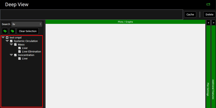
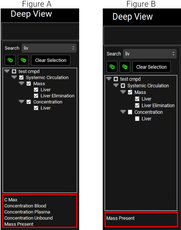
Selecting Systemic Circulation in the example above will select all entries that appear under it and Cmax, Concentration Blood, Concentration Plasma, Concentration Unbound, and Mass Present will be available, as variables, to be plotted.
However, if only Mass is selected, then the only variable below the Series List that is available for plotting is Mass Present.
Analysis view, Deep View, Available variables to plot for Liver series options
The desired options are selected by clicking on the variable name.
If multiple variables are available to plot, then one or more can be selected by ctrl-clicking, shift-clicking, or by clicking-and-dragging.
To select additional curves, perform a different search and repeat the process described above for the new selection.
To reset the Series List, for example if no results are returned, clear the search box and press Enter. The list will be displayed with all levels expanded. Click the ![]()
After one or more selected variables are plotted, the plot can be Cached. To Cache the plot, click Cache (displayed to the right of the ribbon). In the Enter View Name dialog box opens, enter the plot name, and then click OK. The plot is saved and is accessible from a ribbon that is displayed above the Plot pane.
Example of a plot Cached in Deep View
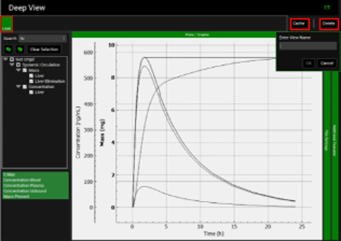
The Delete button removes the plot from the Cache. Cached plots are available in the current session of GPX™ only.
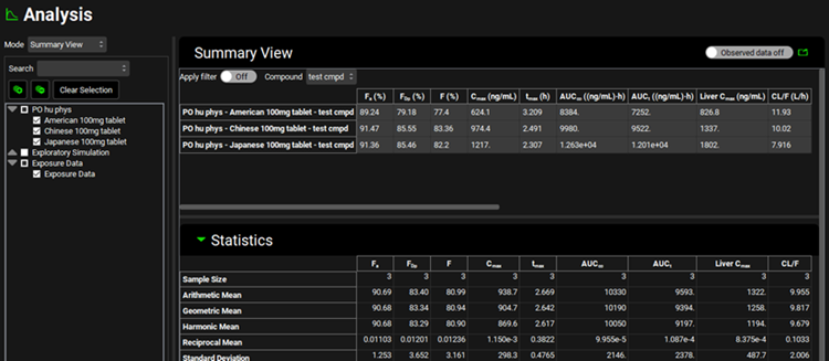
Summary View
The Summary View displays a predefined set of summary pharmacokinetic parameters for the selected simulation(s) in table format. The View also displays critical statistical information for the simulation(s) in the Statistics panel. A toggle allows the Observed data to be displayed (Observed data on, the toggle is green) along with the simulation results. This is on by default, to turn it off click it (Observed data off, the toggle goes grey). The data from both the summary table and the statistics table can be copied by right-clicking on the table, giving the option to copy the data to the clipboard. The data can then be pasted into Excel or another program.
Summary View example
|
Property |
Definition |
|
Fa(%) |
The fraction of the compound that was absorbed as a percentage of the total amount of drug that was administered. |
|
FDp(%) |
The fraction of the compound that was absorbed into the portal vein as a percentage of the total amount of drug that was administered. |
|
F(%) |
The bioavailability of the drug dose as a percentage of the total amount of drug that was administered. |
|
Cmax |
The highest (peak) concentration of the compound that is in the plasma. The units can be edited (ng/mL, µg/mL, mg/mL). |
|
tmax |
The time at which Cmax was reached. The units can be edited (h, min, d, wk). |
|
AUC∞ |
The observed area under the curve (AUC) for the compound extrapolated to infinity. The units can be edited (((ng/L)×h), ((µg/L)×h), ((mg/L)×h)). |
|
AUCt |
The observed area under the curve (AUC) for the compound at the last observation time, t. The units can be edited (((ng/L)×h), ((µg/L)×h), ((mg/L)×h)). |
|
Liver Cmax |
The highest (peak) concentration of the compound that is in the liver. The units can be edited (ng/mL, µg/mL, mg/mL). |
|
CL/F |
The clearance rate of the drug for any administration route (IV or non-IV such as oral), calculated as dose/AUC, with the following caveats:
The units can be edited (L/h, mL/h, mL/min). |
|
RSq; RMSE; MAE; SSE |
These extra measures only appear when observed data are present. RSq: The R-squared is a statistical measure that represents the goodness of fit of a regression model. It is calculated as follows: 
Note: the RSq can be negative based on this definition. RMSE: The root mean square error measures the average difference between a statistical model’s predicted values and the actual values. MAE: The mean absolute error measures the average absolute difference between predicted and actual values. SSE: The sum of squares error measures the difference between actual and predicted values of the dependent variable. |
The following statistics are also summarized in the Statistics panel for the simulation results displayed in the table:
-
Sample Size
-
Arithmetic mean
-
Geometric mean
-
Harmonic mean
-
Reciprocal mean
-
Standard Deviation
-
Geometric Standard Deviation
-
Harmonic Standard Deviation
-
Arithmetic CV
-
Geometric CV
-
Harmonic CV
-
Median
-
Minimum
-
Maximum
-
Standard Error
-
Lower Quartile
-
Upper Quartile
-
90% Lower Confidence
-
90% Upper Confidence
-
90% Ln-Transformed Lower Confidence
-
90% Ln-Transformed Upper Confidence
Sensitivity View
When a Parameter Sensitivity Run is completed the Analysis view opens with the Mode set to Sensitivity View. The Search pane lists all the simulations completed for the PSA and these can be searched as set out in Panel/sub-panel Search feature. The simulations are named according to the name of the baseline simulation used in the PSA plus the name and value of the parameter (or parameters in the case of cross PSA) varied in that specific simulation.
Other Analysis Modes can also be used to view the results of the PSA. For example, Summary View will list the PK parameters for all the simulations completed for the PSA. The Cp-time Key View plot will display the plasma concentration versus time curves for all the simulations, and individual simulation outputs can be examined in Deep View. It is recommended to view other Key View plots for specific simulations only due to the number of curves available.
Sequential Parameter Sensitivity Analysis
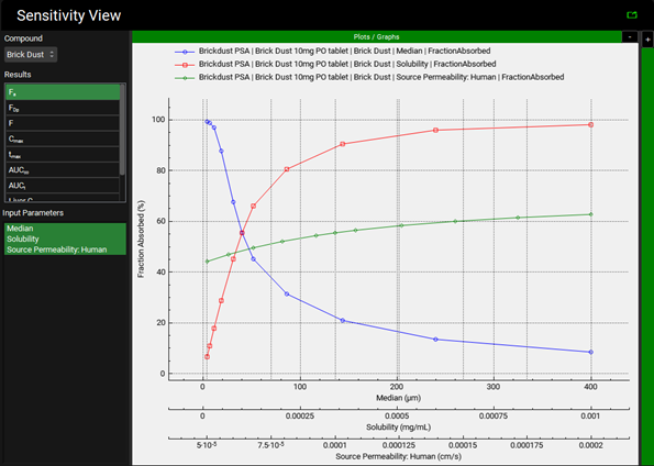
During a sequential Parameter Sensitivity Analysis (PSA), the value is varied for a single parameter at a time while all other parameters are held constant at their baseline values. Sensitivity View displays a sequential Parameter Sensitivity plot which shows the effects on a single Result, such as fraction absorbed (Fa), when the values of the selected parameters are varied.
When the View is first activated the plot will be empty. Select a Compound, Result and one or more Input Parameters to display the plot (see below).
Sensitivity View example for a Sequential Parameter Sensitivity Analysis
|
Input/Option |
Description |
|
Compound |
A drop-down. Selects the compound for which results are displayed on the Sensitivity plot. The list will be populated based on the compounds included in the simulation selected for the PSA. |
|
Results |
Lists the options available to be plotted, namely:
A single result can be selected to be plotted by clicking on the name. For definitions of the name, see Summary View. |
|
Input Parameters |
The input parameters varied as part of the PSA. Single or multiple parameters can be selected by ctrl-clicking, shift-clicking, or by clicking-and-dragging. Note: One x-axis per Input Parameter selected will be displayed on the plot. |
Cross Parameter Sensitivity Analysis
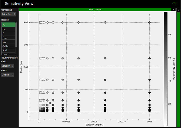
During a cross Parameter Sensitivity Analysis (PSA), parameters are varied in a pairwise fashion while all other parameters are held constant at their baseline values. Sensitivity View displays a cross Parameter Sensitivity plot which shows the effects on a single Result, such as fraction absorbed (Fa), when the values of the selected parameters are varied.
When the View is first activated the plot will be empty. Select a Compound, Result and two Input Parameters (one per axis) to display the plot (see below). The darker the color the higher the value of the selected Result for that parameter pair – the scale is shown on the right-hand side of the plot.
Sensitivity View example for a Cross Parameter Sensitivity Analysis
|
Input/Option |
Description |
|
Compound |
A drop-down. Selects the compound for which results are displayed on the Sensitivity plot. The list will be populated based on the compounds included in the simulation selected for the PSA. |
|
Results |
Lists the options available to be plotted, namely:
A single result can be selected to be plotted by clicking on the name. For definitions of the name, see Summary View. |
|
Input Parameters |
The input parameters varied as part of the PSA.
One parameter from the Cross PSA should be selected on the x-axis and a different one on the y-axis. |
Population View
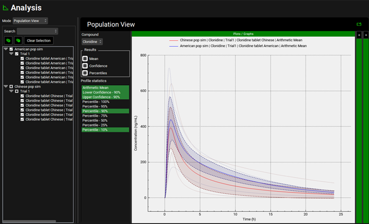
During a population simulation or a Virtual Bioequivalence (VBE) Run, a user can run simulated clinical trials for virtual subjects, combining physiology and pharmacokinetic variability within populations and considering formulation variables that were used as input data in the software. Population View displays a Cp-Time plot which shows the mean and 90% confidence intervals (by default) on a single plot for a single or multiple populations. In addition, percentiles can optionally be displayed (see below).
The Search pane lists all the simulations completed for the Population or VBE Run, and these can be searched as set out in Panel/sub-panel Search feature. The simulations are named according to the name of the baseline simulation used in the Run plus the trial number and the subject number.
Other Analysis Modes can also be used to view the results of the Population or VBE Run. For example, Summary View will list the PK parameters and summary statistics (in the Statistics panel) for all the simulations completed for the Population or VBE Run. The Cp-time Key View plot will display the plasma concentration versus time curves for all the simulations, and individual simulation outputs can be examined in Deep View. It is recommended to view other Key View plots for specific simulations only due to the number of curves available.
Population View example
|
Input/Option |
Description |
|
Compound |
A drop-down. Selects the compound for which results are displayed on the Population View. The list will be populated based on the compounds included in the simulation(s) selected for the Population or VBE Run. |
|
Results |
Lists the options available to be plotted, namely:
Mean and Confidence are selected by default. The percentiles can also be displayed by clicking the check box next to the word “Percentiles” (a solid black square is displayed). To turn off any of the options, click the check box next to the name (the box will go solid white). |
|
Profile statistics |
The options for plotting are displayed under the Profile Statistics and change based on the Results selected. Select the desired statistics for display by ctrl-clicking, shift-clicking, or by clicking-and-dragging. |
Optimization View
During an optimization run, the values varied for one or more parameters are fitted to better capture the selected observed data. The Optimization View displays the results of optimization runs, including the initial and optimized values, statistics associated with the optimization, the resulting observed versus predicted result (based on the selected observed data), and the iteration records. It also provides the option to transfer optimized parameter values back to the corresponding project assets.
The Optimization View has an Optimization View pane and three panels, Series Optimization Results, Pharmacokinetics Optimization Results and Iteration Records.
Optimization View example
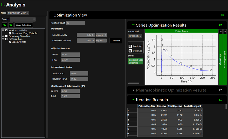
|
Input/Option |
Description |
|
Optimization View pane |
Displays the initial and optimized values, statistics associated with the optimization and the option to transfer optimized parameter values back to the corresponding project assets. |
|
Iteration Count |
The number of iterations used to obtain the displayed Optimization Results. |
|
Parameters |
Lists the parameters selected for optimization along with the following for each parameter:
|
|
Objective Function |
The objective function for the initial and final simulation. |
|
Information Criterion |
The statistics associated with the optimization. |
|
Coefficients of Determination(R2) |
|
|
Transfer All |
A button. Visible if multiple parameters have been optimized. Transfers all optimized parameters to the relevant assets. |
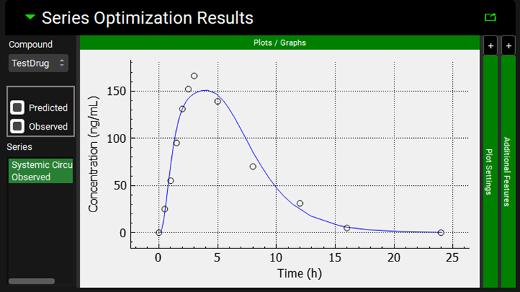
Series Optimization Results Panel
Activated if a series is selected as the observed data against which the optimization was conducted. Displays a plot of observed and predicted values versus time following optimization.
Optimization View, Series Optimization Results panel
|
Input/Option |
Description |
|
Compound |
A drop-down. Selects the compound for which results are displayed on the Series Optimization Results plot. The list will be populated based on the compounds included in the simulation selected for the optimization. |
|
Predicted and Observed check boxes |
Lists the options available to be plotted for each series against which the optimization was conducted, namely:
The check box next to each parameter can be clicked to display or remove the series from the plot. |
|
Series |
The series which can be plotted. If the name is highlighted in green the series will be displayed and can be edited using the Plot Settings. |
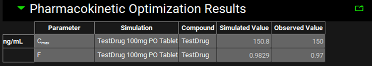
Pharmacokinetics Optimization Results Panel
Activated if one or more pharmacokinetic parameters are selected as the observed data against which the optimization was conducted. Displays a table of observed and predicted values following optimization.
Optimization View, Pharmacokinetic Optimization Results panel
|
Input/Option |
Description |
|
Units |
The units of the parameter against which the optimization was conducted, where applicable. |
|
Parameter |
The name of the parameter against which the optimization was conducted and to which the remaining information in the row applies. |
|
Simulation |
The simulation for which results are displayed. |
|
Compound |
The compound for which results are displayed. |
|
Simulated Value |
The value simulated for the specific parameter after optimization. |
|
Observed Value |
The observed value for the specific parameter. |
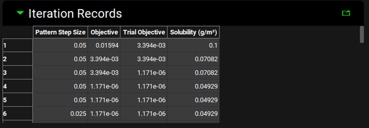
Iteration Records Panel
Displays a table of information regarding the iterations used in the optimization.
Optimization View, Iteration Records panel
|
Input/Option |
Description |
|
Number |
The number of the iteration record to which the remaining information in the row applies. |
|
Pattern Step Size |
The step size used for the specific iteration record. |
|
Objective |
The objective function for the current iteration. The objective function represents the overall error between the observed and the predicted values and is based on the weighting scheme selected for the optimization run (see Observation Selection and Weights). |
|
Trial Objective |
The objective function for the trial of the current iteration. |
|
Simulated Value |
The value (in the units stated in the column header) of the parameter stated in the column header used in the specific iteration record. |